Women for Refugee Women
Rebrand and Campaign
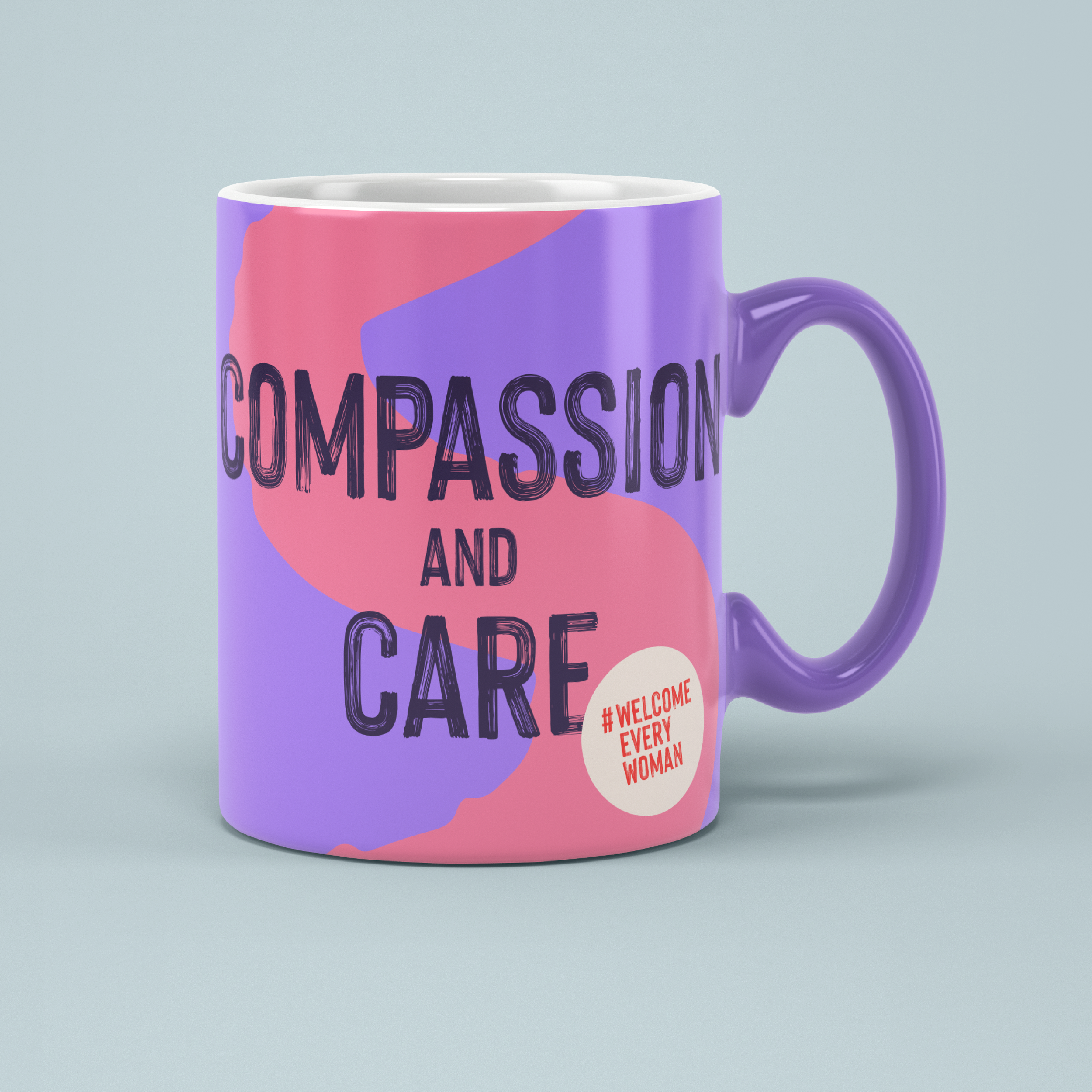
I’ve refreshed Women for Refugee Women’s brand to better represent the refugee women in their network, and their bold and defiant campaigning.
I’ve designed a logo that is both a speech bubble and a megaphone, getting the idea of speaking out and supporting refugee women across.
The logo shape is reflected in the graphic language, representing voices getting louder. This is used to frame words and images.
I worked with illustrator Yasmin Ahram to include an illustration style that communicates the strength and personality of the women that WFRW work with.
The lead colour on this brand is a bright purple, a recognisable development from their previous brand, with added vibrancy. A dark blue adds a needed serious tone, and yellow represents light and positivity.
With Nice and Serious


Welcome Every Woman
The UK government has created a deliberately unwelcoming asylum system that heightens the harm experienced by refugee women. When they arrive here, they face detention and disbelief instead of safety and community.
Together, we are better than the UK Government’s hostility and cruelty.
This campaign showcases the joy and power of the community that ought to be awaiting every refugee woman when she’s seeking safety, while calling on the UK government to ‘Welcome Every Woman’.